Personal Study - Portraiture.
"Exploring surrealist portrait photography."
Through this study, I intend to explore the way in which surrealism can be shown through portraiture; the ways in which the human face and image can be manipulated both through editing and through physical alteration. Portraiture is the discipline in which I have chosen to work, thus making 'surrealist portraiture' a perfect topic for my chosen area for my personal study. From this investigation, I hope to achieve a greater understanding into surrealism and portrait photography and the ways in which faces can be manipulated. This was inspired through my work of manipulating the face to age it and to explore other ways in which the human face can be changed physically.
Ulric Collette's 'Genetic Portraits' (2008)
|
|
|
|
|
|
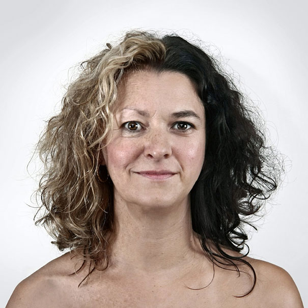
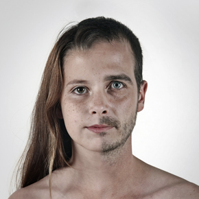
Ulric Collette's 'Genetic Portraits' are a collection of images which he created to explore the similarities and differences in the faces of people who should share similar features; siblings, parents, cousins etc. The result, however, shows that even the faces of people who share the same genetics have very different features which contrast highly with each other when merged into a 'Frankenstein' of the two people. The outcome of this exploration of relatives' faces is an eerie and surreal product, which outlines all of the slight differences in the faces of people who may be seen, normally, to look very similar; even pairs such as identical twins.
The fact that this work was created in the 00s could have had an impact on Collette's style of work and the nature of these images; in a new age where people seem obsessed with the more modern and fresh surreal artwork and photography, works such as this would have been appreciated and enjoyed rather than the more traditional standard portrait photography.
The use of lighting and clear white set means that the models seem very exposed and it is apparent that they are the main focal point of these pictures; the white background combines with soft lighting and the lack of clothing and other costume pieces means that the audience's eye is instantly drawn to the model themselves rather than any other surrounding factors; thus adding to the all-round surreal 'feel' of the images. Similar to the style of Martin Schoeller's work, all of the models appear exposed to the viewer; there are no clever lighting techniques to flatter the model or costume make-up to alter their appearance. The images are honest and reveal all of the model's features, even the unflattering ones such as the creases in the skin- therefore providing a greater contrast between the two models used in one image as the audience can see the clear difference in their faces despite the fact they have been merged into one.
|
This father/son combination stood out in particular to me. This is because, despite the fact that they bear some resemblance (for example, the face shape, hair line, nose and lip formation), the highlighted differences are obvious too.
The main feature which bears the highest contrast between the two seems to be the eyes; the colour, size, shape, and the fact that the father's upper eyelid seems to be much more relaxed and droopy than the son's. Additionally, as expected with such an age gap between the two people, the condition of the skin is very different for each model; the son is younger and therefore his skin is in better form than his father's, tighter and with less wrinkles and dark pigment. The facial expression does not give much away and therefore does not add anything to the image; a positive outcome in my oppinion as it does not take away from the main point of focus in the image which is the use of blending the two faces together. It also would allow Collette to blend the two images easily because the faces bear the same expression and seem to be perfectly aligned. |
Experimenting in Collette's Style.

|
Whilst editing my primary images to achieve Collette's style, I used minimal photoshopping; only really layering the two images and using the 'Eraser' tool to remove parts of one models face to reveal the other model below. This required me to zoom in to make sure that tiny details such as where the nostrils were on the nose did not distort the whole image and show a clear divide between the two.
|
The third and final experimentation in this style was the most successful, I feel that this is because by this point I felt comfortable with the process of creating these images and I had achieved a greater ability for using this technique.
Additionally, the two model's faces weren't extremely different which made it easier to match up the places in which the features matched and lined up; the eyes, nose and mouth were in similar positions.
Additionally, the two model's faces weren't extremely different which made it easier to match up the places in which the features matched and lined up; the eyes, nose and mouth were in similar positions.
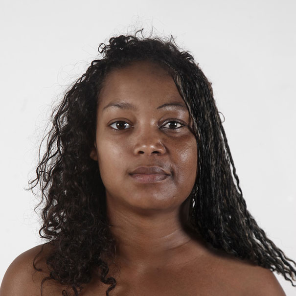
David Hockey's 'Mother'
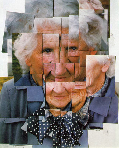
This 'Mother' image, created by David Hockney portrays the way in which a simple portrait image (or images) can be manipulated to become quite surreal and strange. What stands out most to me with this image is the way that it has been cleverly arranged so that the features are obviously out of alignment and have been moved around, and yet the image as a whole still makes sense to the audience; the way in which the brain processes the face so that you can get a clear and realistic understanding of what the actual face would look like. Furthermore, the images used to create this have been captured from all angles and sides of the face so that the audience can really understand what the whole head looks like- down to the neck and ears.
Additionally, another factor which I noticed was that the image doesn't appear to be too manipulated before the photoshop effects; there doesn't seem to be any special lighting techniques used to flatter/alter the face, as well as a lack of expensive and professional set. The image has been captured outside with the model looking as real and as natural as possible.
Additionally, another factor which I noticed was that the image doesn't appear to be too manipulated before the photoshop effects; there doesn't seem to be any special lighting techniques used to flatter/alter the face, as well as a lack of expensive and professional set. The image has been captured outside with the model looking as real and as natural as possible.
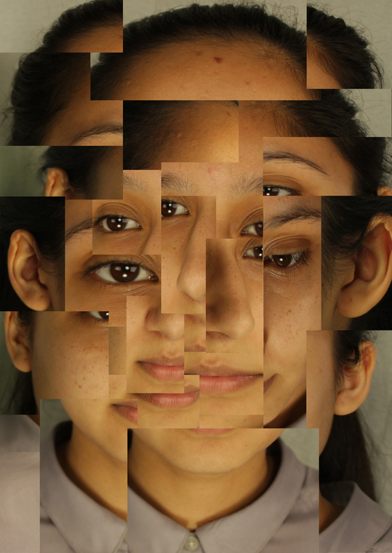
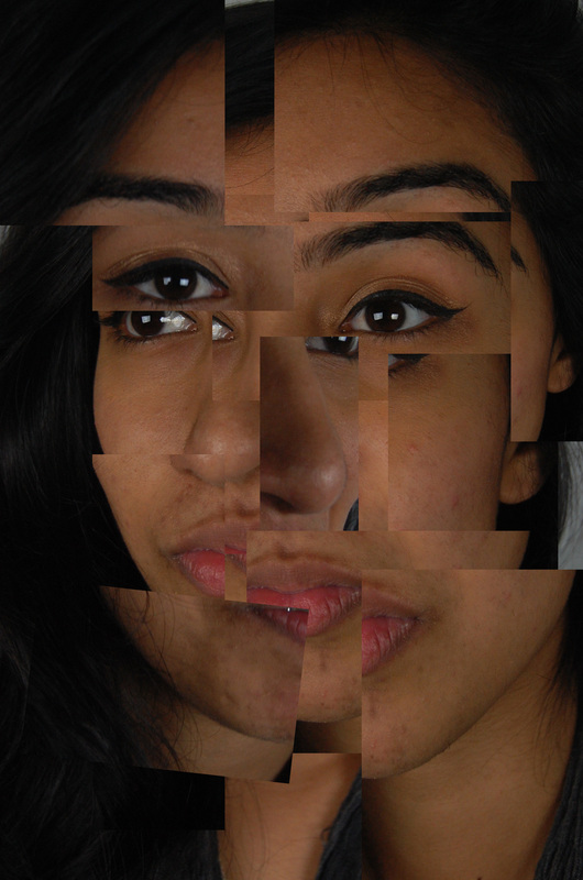
Experimenting in Hockney's Style.

|
This is a very simple and easy method of creating a surreal and yet still recognisable portrait image; I used various images of the model's face from different angles, I then used the 'Rectangular Marquee Tool' to select sections of the face and paste them together on the original. I had to make sure that the features were still aligned and in the right place, i.e. the noses were together and the eyes were in a similar place.
|
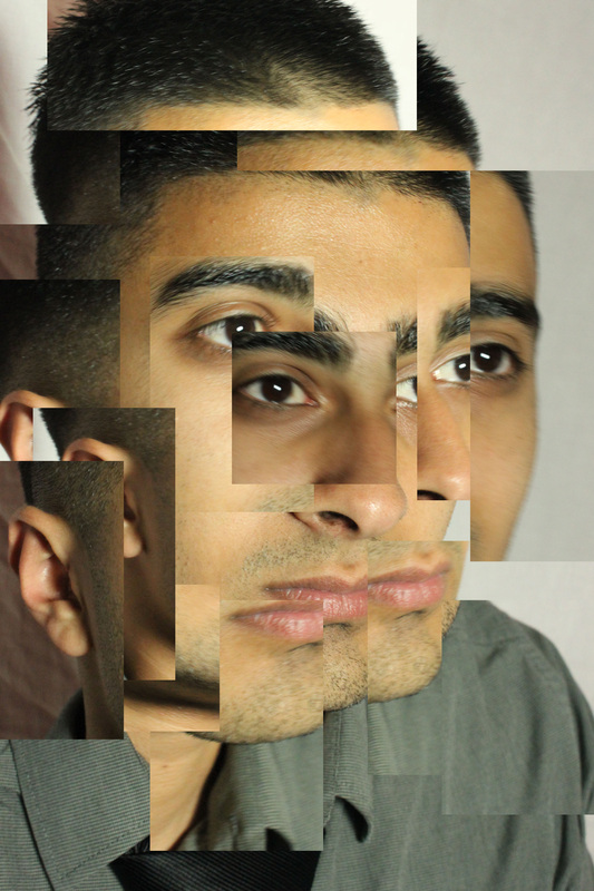
These images weren't as successful as I wanted them to be. I decided to try again, however this time, using photos from all angles of the face rather than one side.