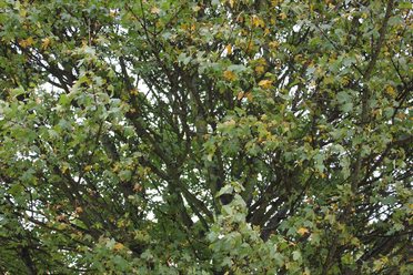
Landscape.
AO1
Contextual Understanding.
Develop ideas through sustained and focused investigations informed by contextual and other sources, demonstrating analytical and critical understanding.
Planning And Idea Sheets.
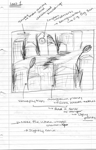
Idea Sheet One.This was my first idea for a final piece. I wanted to capture aspects of London that had the potential to become destroyed on photoshop and manipulated to become very dark and surreal. For this image I was hoping for a cityscape view possibly from a bridge or from a high rooftop overlooking the city and buildings- allowing me to add smoke and various plants and weeds in amongst the buildings. I thought of this idea because of London's significance as a growing city and as one of the busiest capital cities in the world. London is also recognised worldwide because of its growing economy and urban architecture- home to buildings such as the Gherkin and St Paul's Cathedral. This whole idea linked back perfectly to my theme of growth and decay as it would show how such a well-recognised place as London can begin to decay over time due to elements such as time itself, war, abandonment etc. I was also hoping to portray a feeling of wide destruction and decay in my final piece because I wanted a large landscape showing plenty of buildings. It will also portray the feeling of recent destruction, such as the short-term feelings of war, the fresh clouds of smoke showing that it had not always been that way and the damage had recently occurred- again reflecting growth and decay as the city had beforehand been a growing society and system but had begun to decay due to man-made elements. It could also reflect growth and decay because as the city decays, new life grows from it, e.g. the plans and weeds.
|
|
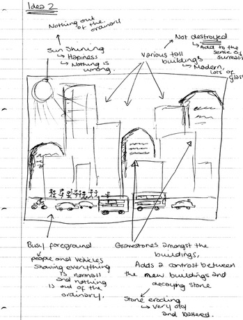
Idea Sheet Two.My second idea consists of a landscape view of busy mainstream London, for example Regents Street or Picadilly Circus. I then had the idea of placing various gravestones in amongst the large buildings, manipulating them to become a similar size and shape as the buildings that surround the gravestones. I intended to capture images of really rough, broken graves- the more textured and decaying the better for this image. This idea would work well with my theme of growth and decay because it shows a great contrast between the decaying gravestones and what they represent (decaying people) in comparison to the constant growth of a busy city. I was hoping for this image to create a very surreal effect because of the brightness of the city, the lights and the hundreds of people- completely unaware of the giant gravestones right above and next to them. Additionally, I would hope for the sunlight to be captured in this image as well as man-made light sources, this is because I think the sun would create a sense of happiness, therefore adding the the surreal overall feel of the image; the contrast between the grey, decaying gravestones and the rest of the average, everyday, unaware scene. This image could also be used to represent the way that many people and their lives go on blissfully unaware of those around us who pass away decay- even when it is right in front of them, almost as if they choose not to see this.
|
|
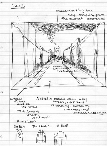
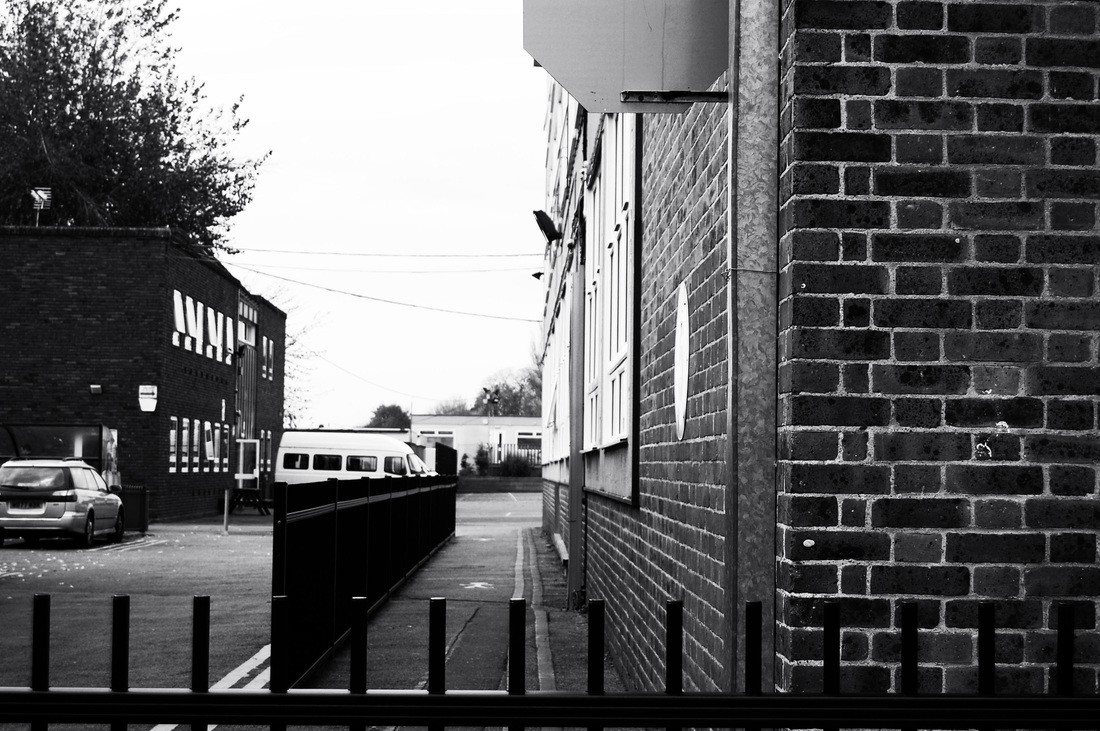
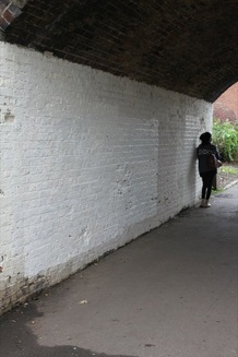
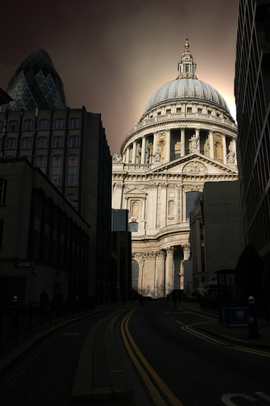
Idea Sheet Three.This idea consists of a small road or alley-way which has extreme shadows and dark areas. I would like it to have a good use of line- all of which lead up to the main subject at the end of the road; this would add emphasis and draw the audience's attention to the subject. Additionally, the desired vantage point would make the audience feel as though they are seeing the street the way they would if they were standing at one end with the subject on the other- therefore adding a sense of reality to it. Ultimately, I would like the raw image to have a sense of abandonment, with no people in the image, and the buildings to be quite drab and monotone to add importance to the subject at the end of the street rather than the street itself. If the buildings were plain they would also be easier to manipulate and add shadows and darkness too, rather than trying to find specific shades of buildings in one place on one street. The subject at the end of the street would have to be of importance and significance to London, as well as being a well recognised iconic figure, for example, Big Ben, The Gherkin or St Paul's Cathedral. This would add greatly to the impact of the image because to see a building of such importance to London going up in smoke in a deserted place shows the scale of the destruction that i want to portray; this meaning that if a significant symbol can be near enough destroyed, imagine what has happened to the rest of London. This could also cause a sense of determination; seeing a symbolic icon standing strong and shining through the smoke could represent London's strength rather than its weakness. This would link into my theme of growth and decay because as the older parts of the city decays, a part of London (e.g. The Gherkin) stands tall- representing its growth.
|
|
Photographer Research.
Atget.
Atget's Work And The Six Rules Of Photography.
|
Atget's photographs are based in Paris, these consist mainly of plain, understated buildings as well as various trees, roads etc. In short- very everyday scenes with no extraordinary content. However, his photographs lack any people; creating a very surreal image which portrays a feeling of isolation, in my opinion this is intentional- the images work well because of the fact that there are no people as it draws more attention to the place itself rather than the normal urban, populated environment which we expect to see. Atget's photography style is very dark, in grey scale or sepia tones. A lack of colour creates a feeling of unease because of the shadows and darkness that has been intentionally captured in, an otherwise, average place. The shadows also add an aspect of mystery as they appear to be concealing or hiding something within them. The idea that his images lack people could be because he wanted to portray what France was going through at that time- the first world war could be reflected by the dark and almost scary images, the lack of people hinting at the absence of so many that were killed during the war, or away fighting it. |
|
Working In The Style Of Atget
I mimicked Atget's work by capturing images of sides of buildings and various areas in which one would usually expect to see a lot of people- a school site usually consists of more people than it does buildings. I deliberately captures these scenes when I knew no people would be around them to reflect Atget's lack of people that causes his typical feeling of isolation and emptiness. After capturing these images I then moved on to manipulating them on photoshop by making them grey scale and then increasing the shadows and contrast which created the dark and sombre areas- a distinctive Atget feature. Ultimately, I intend to continue using the themes and representations that Atget portrays in his photographs through my own work by adding a deserted and eerie aspect, possibly resulting in one of the themes put across in my final outcome.
Feininger.
Feininger's photographs are set in mainstream New York; a place that is usually seen to be full of life and energy. However at the time when he started taking his pictures, America had come out of the depression and just come out of the war, this is shown in an obvious way in his pictures, the damages of the war are shown in many of his pictures through the use of smoke, mist, shadow and darkness. These pictures could reflect the wide traumatic feeling that the aftermath of the war left the public with. The use of smoke in these pictures gives the illusion that New York city was in fact very damaged by the results of the war; the smoke being both literal in the sense that the city was physically damaged and metaphorical, representing the widespread depression felt among the public. A mist appears to be gathering over the city in the majority of his pictures- perhaps representing the way in which the people of New York were being haunted by the repercussions of the war. The use of shadow in these images hints at the darkness that once covered the city through the depression before the boom which pelted America into their prime.
|
|
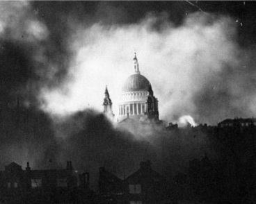
Mason.Herbert Mason captured this famous image of St Paul's Cathedral emerging from the smoke and fire of the London Blitz. This could fall into the six rules of photography under framing the subject, as the black smoke seems to open up onto St Paul's and frame it. To many people at the time, this image represented a mutual feeling that England wasn't going to be beaten and that they would emerge victorious through the war. This picture suggests to me that St Paul's was of significance during the air raids and therefore Mason captured this image with light appearing through the smoke surrounding St Paul's. It implies that St Paul's is a safe haven, possibly because of its own religious significance, almost appearing as heaven in an otherwise dark and scary place. The light that forms around the Cathedral provides a centre focal point for the audience. This contrasts greatly with the thick black smoke engulfing the rest of the image and the smaller, less significant houses. This image has inspired me greatly and I would like to begin to reflect not only some of the ideas shown in it but also the themes that are suggested of hope and light in a dark and hopeless place.
|
|
Many links can be made between the work of Atget, Feininger and Mason. Their work all reflects either the dark and destructive effects of war or the feelings that are shared by people during wartime such as hopelessness and despair. Although not all their photographs were not taken during the same war, the messages that are represented in them are very similar- the smoke and shadows in all of the images representing the dark cloud that hovers over everyone whilst war is taking place, and the dark and ugly effects that war causes. In addition, they all chose to portray the urban landscape- London and Paris. Atget and Feininger's work both link in terms of their style of photography, they both capture with an excellent use of line.
AO2
Creative Making.
Experiment with and select appropriate resources, media, materials, techniques and processes, reviewing and refining their ideas as the work develops.
The Six Rules Of Photography.
Landscape.
Landscape images are images which have a large depth of field in comparison to portrait photographs. They allow the photographer to capture a wider range of subjects and allow more into the frame. Additionally, the camera is usually held horizontally to capture landscape images.
|
|
Portrait.Portrait is a way of capturing a very narrow depth of field, and usually one specific subject, or very few subjects. Usually used for detail and precise subjects rather than large scenes. The camera is also usually held vertically to capture portrait photographs.
|
|
Panning.Panning is a technique used to capture a moving subject, making it appear clear and focused whilst the rest of the image is blurred, creating a sense of movement within the image.
|
|
Framing the subject.Framing the subject is an ideal way of drawing attention to a specific subject of object, or even a scene or setting. This should usually consist of something that has naturally formed there and was not created with the intention of becoming a frame- this adds to the creative effect of being able to use everyday objects as frames which surround the desired subject. Ideally, both the frame and the subject should be well lit and focused to create a clear image.
|
|
Filling The Frame.Filling the frame is a way of capturing an image without anything that is added or unnecessary. To create an image like this it is ideal to be close to it and to not have any other subjects within the viewpoint, excluding elements such as the sky or the ground.
Filling the frame allows you to have a very detailed image of a specific object and allows you to focus on one specific thing, therefore emphasising it- rather than separating your attention on several objects. |
|
Depth Of Field.Depth of field is the amount of focus that is attained on a certain object. For example, the object in the foreground that is the main focal point of the image has been focused on greatly, creating an almost 3D effect, as though the subject is closer to you than the rest of the image. Depth of field allows the unnecessary information in the background of the image to become blurred in comparison to the sharp, detailed main subject.
|
|
Use Of Line.Use of line usually requires a subject that the lines lead up to, allowing the eye of the audience to travel along the lines and fall upon a person, place or object. This allows the photographer to be very creative as the lines could be formed out of any everyday object and the subject of the image itself does not have to be something literal- perhaps a place or a setting. This causes questions to be raised in the audience's mind such as; Why is this the subject of the image? Why is it significant?
|
|
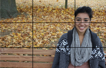
Rule Of Thirds.Rule of thirds basically provides guidelines for the photographers to compose their images. This makes it easier to create a final image with no interference from unnecessary objects; drawing more attention to the subject itself. The easiest way to do this is to break the whole image down into 9 sections- assigning each section to a part of the image, between 3 and 6 of these should be assigned to the main subject, the rest to the backgrounds etc.
|
|
Vantage Point.
Vantage point is the best viewpoint for the photographer to capture an image. This could alter the opinion of the audience viewing the image as the vantage point could be from any angle or height, for example, if the image was captured from a low angle it would make the subject appear taller than it actually is and vice versa for a high angle. By manipulating the camera angle, the image itself can also be manipulated and therefore, so can the opinion of the audience viewing it.
|
|
Raw Photo-shoots.
St Paul's Cathedral.Here, I selected 12 images from the 94 that I took of St Paul's Cathedral. These are a mix of the pictures that I thought were most affective and a few that I thought didn't work as well. The first 6 images are the ones which I thought worked the best, this is because they came out clear, at a good angle, and some of them fall into the six rules of photography; the second image works as a rule of thirds as both of the steeples fit on either side of the image with the main building filling the bottom column. The third image is from a lower vantage point and seems to tower above the subjects that would be below it. The fifth image is one of my personal favourites from the photo-shoot; this is because it portrays the sheer size of the cathedral and the magnificence of the intricate designs. It is also very visually appealing because of the composition- the subject fits perfectly in the image. However the last 3 images are ones which I don't think worked as well as the others. For example the last image, It doesn't appeal to be because of the shadows from surrounding trees at the bottom and the fact that the steeple at the top appears a lot smaller than I wanted it to because of the lower vantage point that I took it from.
|
|
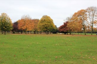
London Cityscapes.Here I attempted to capture some of London's views from various bridges and angles. I wanted scenes that weren't perfect or very attractive as I want my final outcome to be slightly damaged and almost gritty. In my opinion, none of these images worked very well as I couldn't get close enough to take a detailed picture, the buildings don't look focused enough, and in the eyes of someone who didn't know the images were of London, it wouldn't be at all obvious. I decided not to use these images in my final outcome as they, or any other landscape, do not show clearly enough the theme that I want to portray of growth and decay. It also appears to be too light and almost too happy, I want to capture images of something slightly darker and more eerie in itself, before I begin to use photoshop to manipulate it- possibly of alley ways and dark roads leading up to the main subject rather than having a landscape with various subjects.
|
|
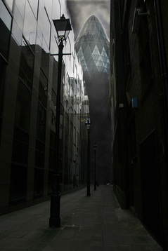
The Gherkin.Here are some images of The Gherkin which I captured. I chose to use The Gherkin because it is recognized worldwide as a modern day work of art and architecture. It is very recognizable and is a well known, iconic figure of London- adding dramatically to London's skyline. Initially, I wanted to use an image of St Paul's rising out of smoke in my final outcome to represent London, it's power and to show it's constant growth, however I decided that this particular building would be more suited for this representation as it is very modern day and shows clearly modern day growth. This would be much more symbolic rising out of the smoke as it conveys the same message of strength as Mason's image and almost hints at the idea of a new era because of it's modern significance. I also wanted to add my own personal twist on the image of St Paul's by Mason, rather than mimicking the original by using the same building. This idea for a final outcome also links into my theme of growth and decay- as the older, weaker parts of the city decay in the smoke, the Gherkin rises out of it as a new and contemporary symbol.
|
|
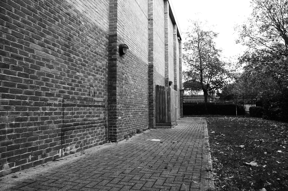
Roads And Alley-Ways.Here are images of an empty large road and a small side road. The main road at first appeared perfect to use because it conveyed the message of growth and decay of a city on a large scale because of the size of the road. However, I decided to use the smaller side road because it had a better desired affect when I manipulated it by increasing the shadows and contrast to make it darker. I thought this would work perfectly with the theme I want to convey of growth and decay to the audience by creating darkness and an almost scary feeling to show how the alley way is in a dark and decaying place compared to the main subject (The Gherkin) which is standing tall and bright compared to the otherwise dark place. I also want it to give the audience a sense that the alley way is leading up to something, and create a comparison and contrast between the alley way itself and the feeling created by it compared to the Gherkin and the message conveyed by its brightness. Additionally, these small roads work well because they relate back to my chosen photographer and show how he has influenced and inspired me- the alley ways have an slight feel of surrealism, shadows and monotone just as Atget's work did.
|
|
Overlapping Buildings.I chose to capture images with a series of buildings overlapping to portray the density of London's main city centre, these show not only the amount of buildings that are clustered together, but also show the amount of people that there must be in order for many large buildings to be required. I chose to capture these specific images because for my second final outcome I wanted to produce an image of the Gherkin appearing from behind other buildings, not entirely but just visible to see slightly. I captured these images from a low vantage point because it shows the sheer size of the buildings and additionally shows the size of the Gherkin compared to the other buildings in the foreground. I think the first 3 images in the slide show are the most affective as they allow the audience to catch a glimpse of the Gherkin without revealing it fully or making it too obvious that it is there- leaving room for a lost of photoshop manipulation because of the image's simplicity. The last 3 images were taken with the intention of later adding in the Gherkin, however I decided that these would not have the desired affect as I wanted the Gherkin to loom over the other buildings and this effect would not have worked because the other buildings in the image are already very large.
|
|
AO3
Reflective Recording.
Record in visual and/or other forms ideas, observations and insights relevant to their intentions, demonstrating an ability to reflect on their work and progress.
Landscape Final Piece Experiments.
Creating Smoke.
I began to experiment with creating smoke on photoshop because to use real smoke and edit it into an image appeared too obviously placed on top of another image. To do this I used the paintbrush tool and alternated between different brush diameters and opacity to create the different textures and thickness of the smoke. I then edited the contrast and brightness of the smoke once it was created to alter the overall perception of it- increasing the contrast for an all-round darker effect, or enhanced the brightness to create a lighter, happier feeling.
|
One. This was my first attempt at creating smoke on photoshop. In my opinion it didn't work well at all; the smoke was too obviously photoshopped in and didn't look real enough. However, I think the tones and opacity used to create smoke worked quite well and I continued using this opacity and brush width to create more smoke experimentation.
Two. This was an improvement compared to my first attempt at creating smoke through photoshop. I think this is because it has a better texture and a more realistic feel to it. However, this texture is more likely to be seen in a close-up picture of smoke rather than that of smoke from a distance- making the whole image seem slightly out of place and unrealistic. Three. This is the same image as number two, however I tried to make this smoke have a more defined shape- as though the smoke begins thin at the bottom and rises up creating a thicker cloud above the rest. I think this worked successfully and looks more realistic than the previous image. Four. This was the most successful experiment in my opinion, this is because although it is simple and not alot of detail is in the image, a lot of detail is not needed and works well due to the simplicity. |
|
St Paul's Cathedral Smoke Effects.
Here are four attempts at creating smoke around St Paul's Cathedral, I chose to do this for two reasons; firstly to attempt to work in the style of Mason and recreate his image of the Cathedral, and secondly to experiment for my final outcome, to produce an image that could show a symbolic icon of London rising out of smoke. I used photoshop to do this, using the same techniques as above, however I used white to overlap the black paint tool to show the brighter areas around the building in comparison to the rest of the thick black smoke. These images are in order of how successful they are, the first being the least successful and the last being the most successful.
|
One. I think this is the least successful of all the images because it is the most obviously photopshopped of the four, the brush strokes are clearly visible and the whole image doesn't merge together very well.
Two. This was an improvement from the previous image because I began to blend the colours together using the smudge tool to create a smoother, more realistic texture and colour to the smoke. However, in my opinion, this image didn't show St Paul's in enough light and overall the image was too dark. Three. Here, I experimented with increasing the thickness and darkness of the smoke and also increasing the light behind St Paul's to give it a slight angelic glow, to do this I opened the lighting effects and increased the diameter of the light, the brightness, and changed the type of light from 'spotlight' to 'omni'. I thought that this worked very successfully, however I thought that the smoke needed to be slightly paler. Four. In my opinion, this was the most successful experiment; the light behind St Paul's gives off the desired message of hope and strength, whilst the smoke that surrounds it is just the right shade, thickness, and texture. |
|
Final Piece Photoshop Steps.
|
Final Piece 1.
This was originally intended to be one of my final outcomes, however I felt that it looked slightly out of place and therefore decided not to use it as a final piece. Although it successfully shows the type of message that I wanted to convey in my final outcomes it does not really conform to the house style which the rest of the images share and therefore I used it as an example of experimentation as it required a lot of photoshop manipulation. I started by using the eraser tool to take out the building at the end of the alley-way. Then, on a separate layer I used the magic wand tool to select around the Gherkin, followed by copying and pasting it onto the first layer of the alley-way. I then needed to add smoke to achieve the desired effect of burning and decay- to do this I used the same techniques that I had been practising; using the paintbrush tool in different opacities and diameters to give the smoke colour and texture. I then noticed that the sky was too empty and white- it looked too clean and angelic, the opposite of what I wanted to achieve. So I decided to add more smoke into the sky to create a dark and scary effect. I then merged both of the layers together to form one final piece image. Originally, I had planned to use this as one of my final outcomes. However, I decided not to as it did not fit in with the series of images that I decided to use as final-pieces; the message conveyed is very different and does not carry the same house-style of lighting, darkness and composition. Furthermore, the way in which the smoke has been added through the use of photoshop manipulation does not come across as very effective; the smoke does not look as realistic as I had intended it to and therefore makes the whole image seem unprofessional and slightly messy.
|
|
Final Piece 2.I started by using the quick selection tool to select the sky, I then altered the colour; increasing the red, magenta and yellow to create a reddish glow in the sky- representing perhaps danger. I then selected the buildings in the foreground using the quick selection tool; I used the brightness and contrast settings to make these buildings darker, but so that it is still apparent that they are buildings. I created a silhouette by making them dark and increasing the contrast. I then used the quick selection tool to select the Gherkin, again using the contrast and brightness settings to make the Gherkin appear brighter than the other buildings and the red sky. Finally, I used the lighting settings to add an 'omni' light behind the Gherkin, to give the illusion that the Gherkin itself is giving off light. |
|
AO4
Personal Presentation.
Present a personal, informed and meaningful response demonstrating critical understanding, realising intentions and where appropriate, making connections between visual, written, oral or other elements.
Final Outcomes.
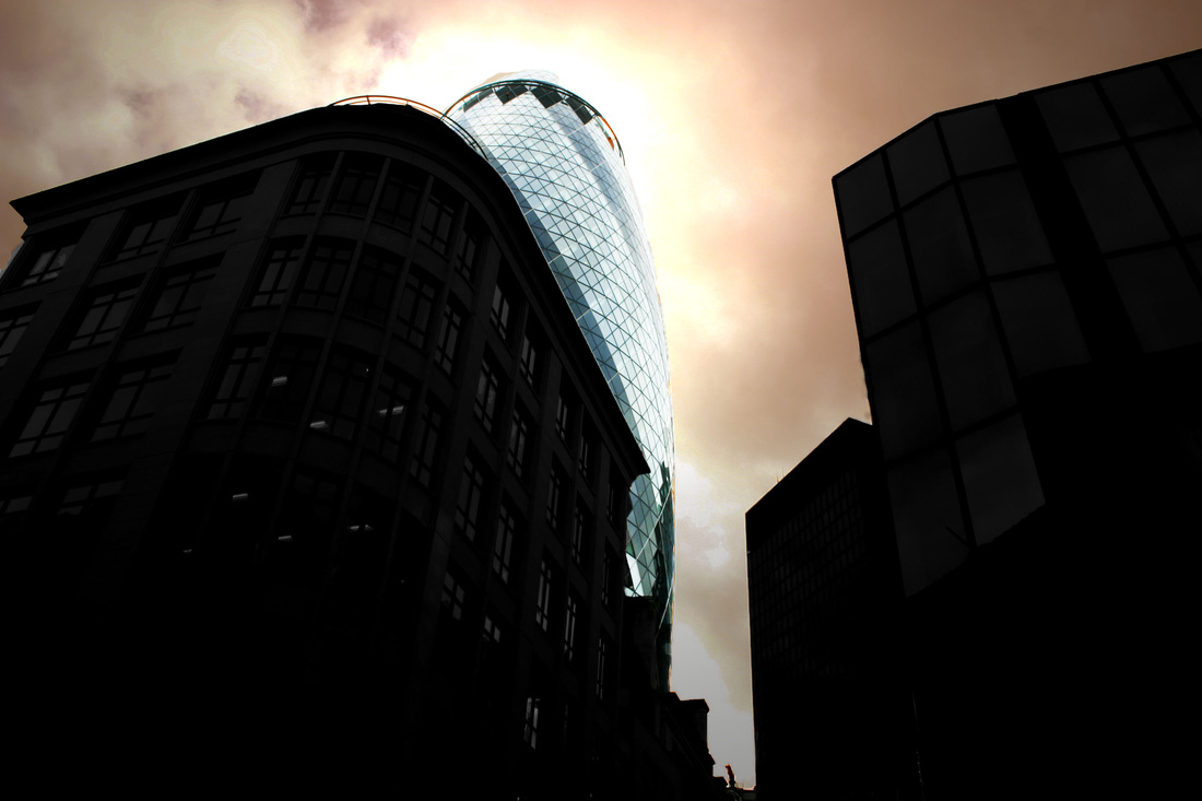
My intentions for this final outcome were to take inspiration from various photographers which I have studied such as Mason. I wanted to portray a famous landmark (The Gherkin) as an almost angelic symbol in an otherwise dark and lifeless place. I tried to show my topic of Growth and Decay- an aspect which I believe this final outcome portrays- as certain aspects of the city appear to be decaying, another aspect remains strong and prosperous.
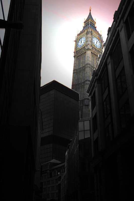
This final piece also turned out very successful; the lighting represents Big Ben in an iconic way, almost angelic emerging from the darkened buildings in the foreground. There is an intentional house-style running through the final outcomes; the sky is tinted red- further hinting at trouble or dismay and the buildings have been darkened to emphasize the growth of the building in focus- in this case Big Ben.
Finally, this final outcome turned out very successfully. Using St Paul's Cathedral to represent and convey the same message that the other final outcomes do. The house style is shown again through the use of lighting, shadows and composition.
