Art 4- Exam.
Initial idea/ brainstorm.
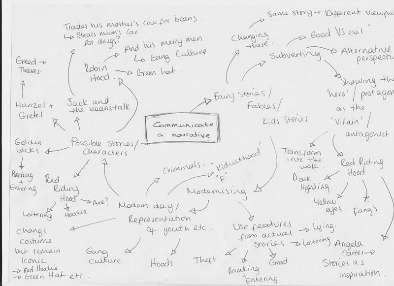
I have decided to follow the theme of 'Communicating a narrative' for this project. I was initially thinking of choosing a single novel and representing the story/ theme/ idea/ fashion etc. However, I thought it would be more appropriate to perhaps take an element of dark comedy and subvert stories which are widely known. Fairy tales, fables and children's stories were the first things which came to mind as well known stories with iconic characters which could be represented. This is because they are widely known and the characters are recognised by many people; therefore allowing me to subvert these characters whilst still reaining iconic and recogniseable.
As I have chosen to subvert the way in which these initial innocent protagonists are shown, I decided that adding a modern-day element of how youth is represented in the media could work really well; modernizing the main characters and showing the way that youth are seen today. For example; Red Riding Hood could be shown as stereotypically 'scary' and violent, keeping the main themes and icons from the story (the hood would become a red hooded jumper, the axe or a similar weapon).
I also intended to show the way in which the initial story can be changed completely because of the point of view; portraying Goldie Locks as someone who breaks and enters or perhaps as a homeless beggar, Robin Hood as the leader of a gang who steals and mugs innocent people etc.
Novel Inspiration: Anjela Carter's The Bloody Chamber.
I took inspiration from Angela Carter's The Bloody Chamber for the idea of subverting children's stories into less innocent versions. She uses stories such as Red Riding Hood, changing it into stories whereby the young girl succumbs to temptation of riches and wealth and therefore murders her grandmother; framing her as a witch to the people of the village.
She also uses stories such as Snow White, Blue Beard, Beauty and The Beast and Puss in Boots, using recognizable elements from each but adding a dark, immoral twist.
I took inspiration from her from the way in which she makes these innocent tales become the stuff of adult nightmare; the loss of innocence and subversion of the children's stories creates an eerie and surreal feeling- something which I intent to include in my own images.
Initial visualization.
|
|
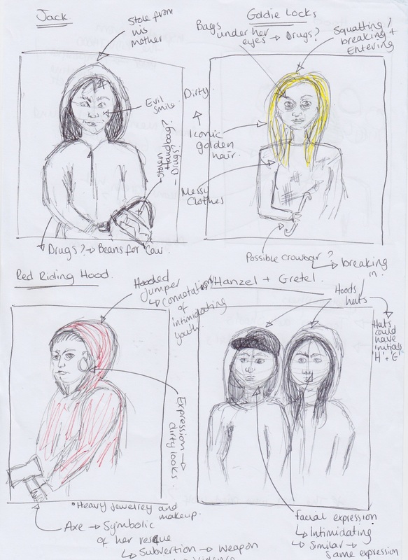
These are some of the visual ideas which I began to think of which I could use to portray a modernized representation of the protagonists within well-known children's stories. The main stories which I have initially chosen to work on are; Jack and the Beanstalk, Red Riding Hood, Goldie Locks, Robin Hood (and his Merry Men) and Hansel and Gretel. These were rough sketches which I used to note what I pictured the final outcomes for each tale to look like, focusing largely on factors such as costume, hair and makeup and composition as these would be key to recognizing the character within the image and making the link between them and the dark twist on their story.
Photographer Research.
Martin Schoeller.
|
|
|
|
|
|
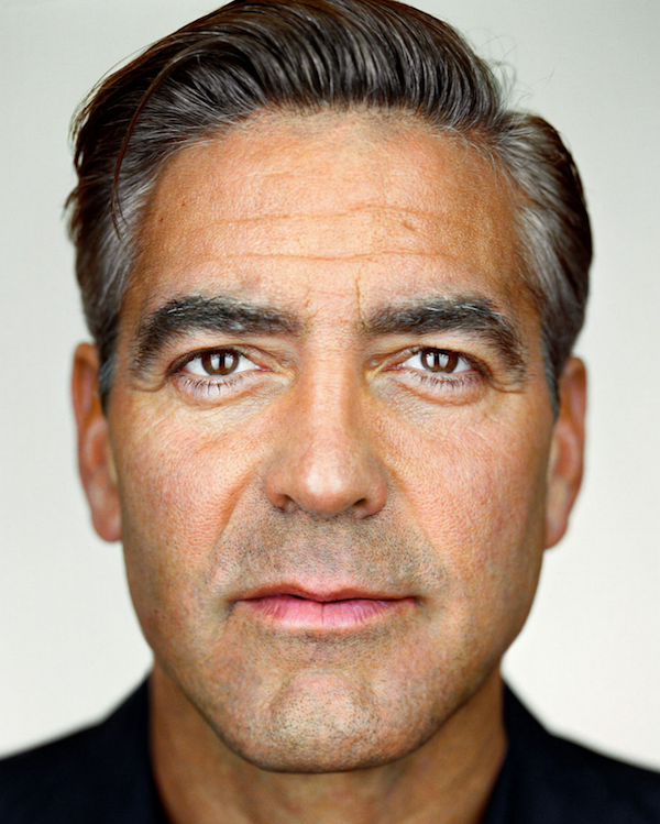
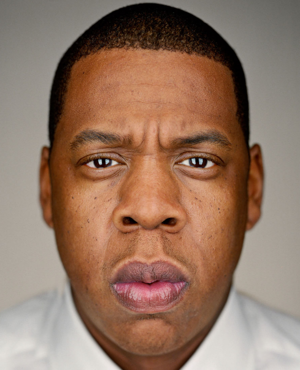
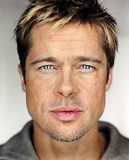
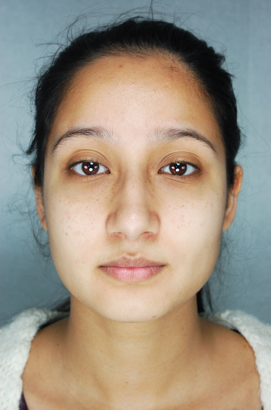
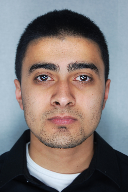
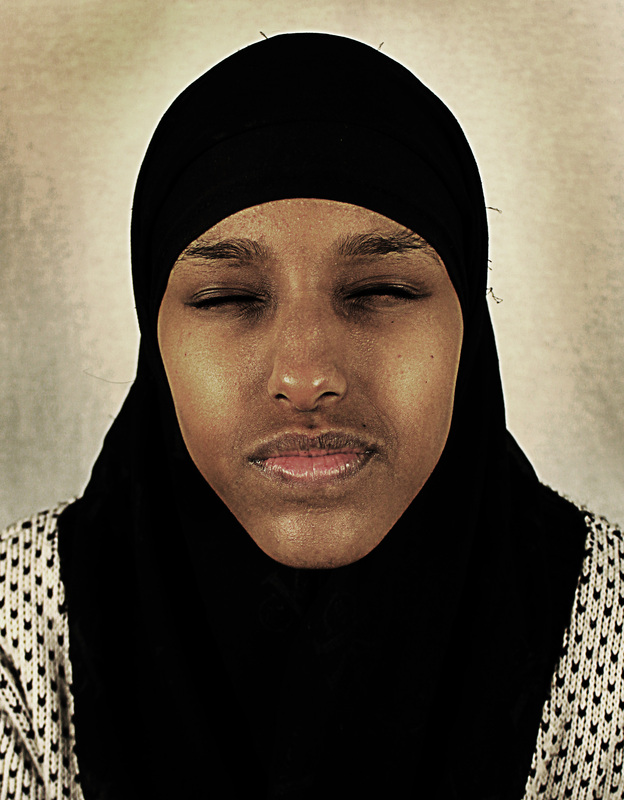
Martin Schoeller uses well-known celebrities and captures them in their rawest form: no specialist lighting techniques used to provide flattering shadows or to manipulate the face to become more visually appealing, just bright and revealing lights in front of a bright back-drop. This removes the barrier between the famous and the every-day people; showing that even people which we idolize and assume to have no imperfections, in fact, do.
The lighting is the aspect which I intend to take inspiration from with Schoeller's images, it seems that there is brighter light directly in front of the model's face; perhaps clam-shell lighting- no shadows are created under or above the nose, eyes, etc; so a light both below and above the face would create brightness and also create the catch-lights in the model's eyes. Whilst still bright, the shadows are more dominant on the sides of the face than anywhere else, so two larger soft lights either side of the face but less close would likely cause these- creating more focus on the face and features and thus further exposing the celebrities' imperfections and features such as wrinkles, skin impurities etc.
The lighting is the aspect which I intend to take inspiration from with Schoeller's images, it seems that there is brighter light directly in front of the model's face; perhaps clam-shell lighting- no shadows are created under or above the nose, eyes, etc; so a light both below and above the face would create brightness and also create the catch-lights in the model's eyes. Whilst still bright, the shadows are more dominant on the sides of the face than anywhere else, so two larger soft lights either side of the face but less close would likely cause these- creating more focus on the face and features and thus further exposing the celebrities' imperfections and features such as wrinkles, skin impurities etc.
Lighting Experimentation.
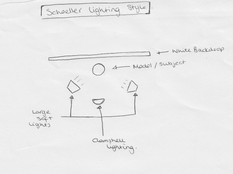
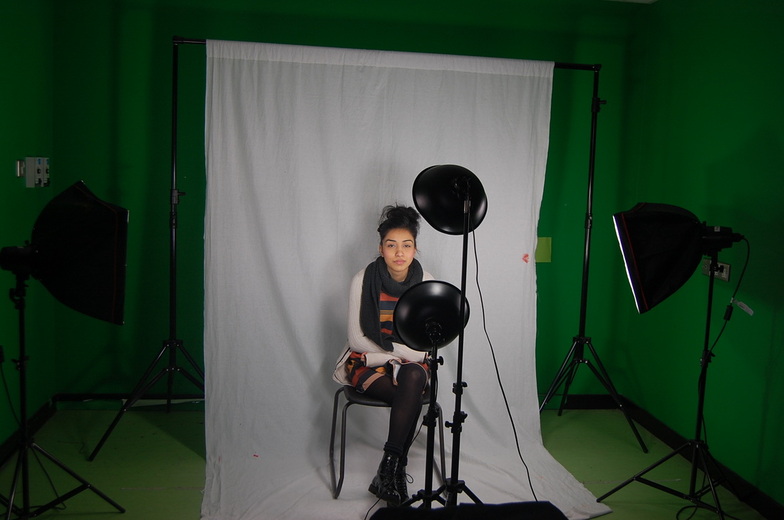
This experiment was to attempt to mimic Schoeller's style of lighting. To do this, I used two large soft lights either side of the face, and clam-shell lighting using harder lights closer to the face in order to brighten the center and to create the catch lights which are visible in Schoeller's images.
This was quite successful, I managed to create a similar brightness and a slightly darker, shadowed area either side of the face.
In photoshop I went on to exaggerate these catch lights as well as slightly adjusting the brightness and contrast and sharpening the face and blurring the hair, neck and ears.
Photoshop enhancement.
Photoshop enhancement was very simple. The only alterations which I made were to exaggerate the features which had already been captured in the photoshoot.
I firstly increased the brightness and slightly increased the contrast; showing the points at which the light hit the face most dominantly, therefore mimicking the style of lighting shown in Schoeller's images.
I then used the 'Dodge' tool to increase the brightness of the catch-lights in the model's eyes, as well as enhancing the brightness of the skin around the forehead, cheeks, nose, and chin.
Finally, I used the 'Sharpen' tool to enhance the model's face and the features which are closest to the camera such as the nose, eyes and mouth. I then used the 'Blur' tool to do the opposite around the face and blur the hair, neck and clothes; therefore emphasizing the facial features further.
Outcome.
|
|
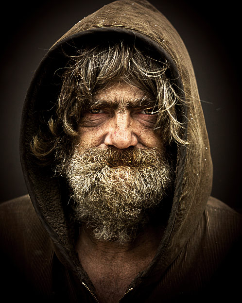
Andrzej Dragan.
|
This image captured by Dragan inspired me with the stye of lighting and the grainy, contrasted texture. His use of a male with a thick beard and hair meant that there was a lot of area for the lighting and shadows to fall on. Additionally, the whole image has a feel of being worn away and damaged- unkempt clothes, messy hair and a facial expression which emphasizes the wrinkles in the skin and therefore makes him appear old. The eyes are highlighted and apparent; contrasting with the dirty skin of the model and therefore enhancing them further.
Additionally, the lighting used gives the image a slightly surreal feel; spray-lighting is used in the background causing a glow around the model's face. Whereas the lighting on the face doesn't seem to have been manipulated by the photographer- natural light appears to be the dominant light on the face.
Additionally, the lighting used gives the image a slightly surreal feel; spray-lighting is used in the background causing a glow around the model's face. Whereas the lighting on the face doesn't seem to have been manipulated by the photographer- natural light appears to be the dominant light on the face.
Photoshop Enhancement.
I began creating Dragan's style on photoshop by adjusting the 'Levels' settings. I then created a new layer and on this one I opened the 'High Pass' settings and changed it to 10.6 pixels, meaning that when the layers were re-adjusted the overall image would look very grainy and gritty. Using the 'Burn' tool, I emphasized the dark areas around the eyes and in the lines around the mouth to make the face seem as textured as possible. Finally, I used the 'Sharpen' tool to increase the graininess of the face and the 'Dodge' and 'Burn' tools to create the desired glow around the model's face and the darkness in the background.
Outcome.
Tim Burton/ Cartoonized Characters.
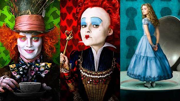
Tim Burton's characters within his films such as Alice in Wonderland and Charlie and the Chocolate Factory have a certain distinctive look about them. While they are filmed using real people, the after-effects, lighting and makeup combine to make it seem as though the characters are almost cartoonized. This is a factor which I would like to encorporate into my own work as it comes accross both eerie and visually interesting as it is not completely clear whether they are real people or have been created by technology.
I also like this idea because of the characters which he creates; he mainly uses effects like these on films aimed at a young audience; just as the characters within my images belong to stories aimed at younger people. Additionally, I find that it makes them look slightly surreal; an element which I would like to be apparent in my images as the initial stories have been subverted and made scarier and darker- adding an element of surrealism could, perhaps, enhance the image's overall feel.
I also like this idea because of the characters which he creates; he mainly uses effects like these on films aimed at a young audience; just as the characters within my images belong to stories aimed at younger people. Additionally, I find that it makes them look slightly surreal; an element which I would like to be apparent in my images as the initial stories have been subverted and made scarier and darker- adding an element of surrealism could, perhaps, enhance the image's overall feel.
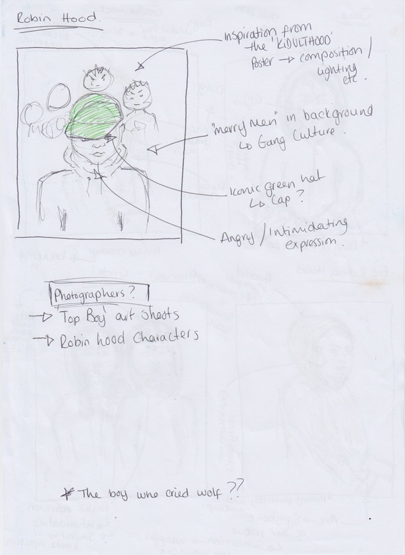
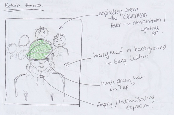
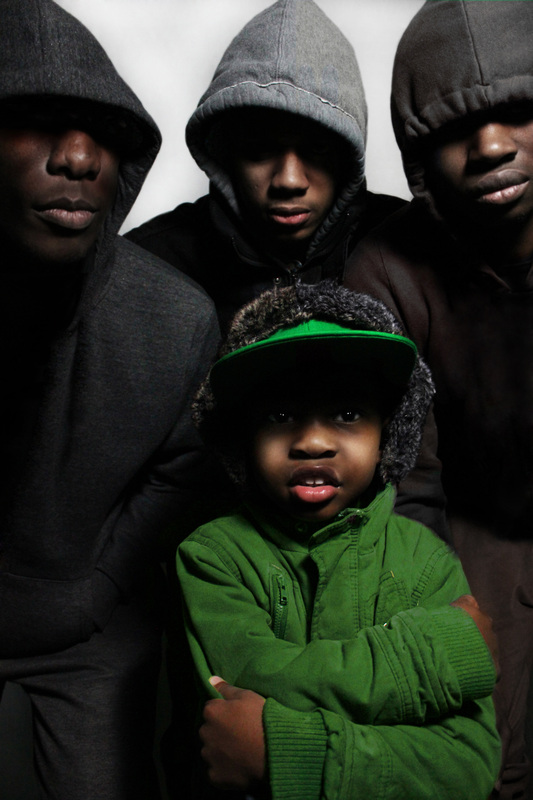
'Robin Hood and His Merry Men'
Visual Inspiration
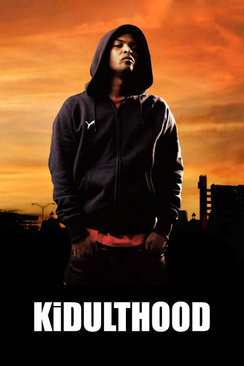
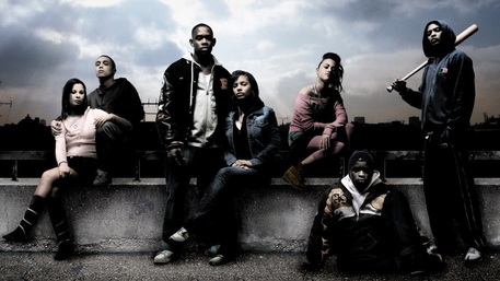
'KiDULTHOOD' posters.
|
|
These posters were my visual inspiration for the way in which I would attempt to re-create Robin Hood and his merry men in a modern day way and to represent the themes of gang culture within this. I had decided that the image should consist of Robin Hood in the foreground and his gang behind him; appearing much as the models in these posters do (e.g. the style of clothing, composition, hair and makeup which shows the generic and typical portrayal of teenagers in modern day media.)
Both posters seem to have been captured from a low-angle shot; thus making the subjects seem more intimidating and the moody lighting reflects the hostility within the gangs towards outsiders.
To keep the theme of the story of Robin Hood within the image I would incorporate themes of theft, seeing as the gang stole from the rich and gave to the poor- this could be subverted and exaggerated to show that they assault and rob people; perhaps with the use of props.
Final Photoshoot.
This photo-shoot is based on the story of Robing Hood and his Merry Men. To portray the idea of youth representation onto these characters and give them a modern-day twist, I chose to work around the idea of gang culture as well as the idea that younger people are beginning to be shown in this way; using a young model as the main focus of the image. The green cap on 'Robin' is a reference to the actual story, as well as a modern-day reference to the representation of 'hoodies' and young people obscuring their faces. I wanted this to be consistent throughout the photo-shoot, and therefore asked the other model's to wear hooded jumpers and jackets, puling the hoods up so that their eyes remained in shadow.
I used the lighting to create the shadows across the model's eyes; using butterfly lighting meant that these shadows were captured more easily and therefore I would not have to create them myself later on.
The composition was similar throughout the photo-shoot, I used the model for Robin in the foreground and centered, with the three 'Merry Men' in the background, intentionally making them appear bigger, to give the impression that 'Robin' is being protected (or pressured) to act like them.
Creating shadows.
In some of the images which I thought worked really well, the shadows which I needed were not there; for example one of the model's eyes were showing when the rest were in shadow. To alter this to the desired effect, I used the 'burn' tool in Photoshop with a soft edge to create darkness over the model's eyes while still keeping a realistic soft and shadow-like edge.
Before.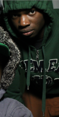
|
After.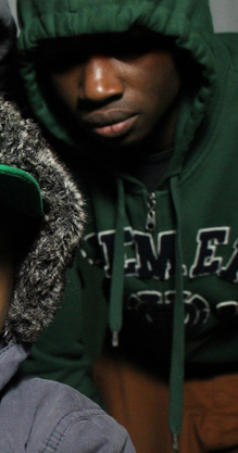
|
Changing/ Enhancing Colours
After my initial experiment with swapping colours, I decided to try it using the images from my photoshoot. To make the theme of 'Robin Hood' more apparent in the images, I needed to enhance the colour and amount of green on the main model in the foreground, as well as taking the green out of one of the models in the background. I then altered the Hue, Saturation and Lightness to achieve the colour which was more suitable.I used this to both enhance the amount of green and the vibrancy on the main model's hat and to decrease the amount of green (or change the colour completely) on the model in the foreground who had previously been wearing green.
Before.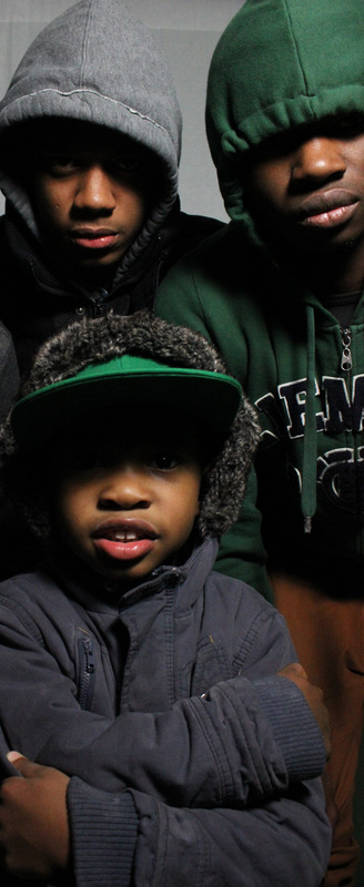
|
After.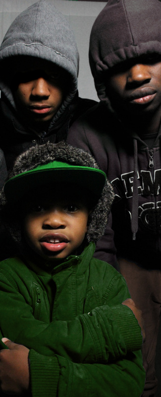
|
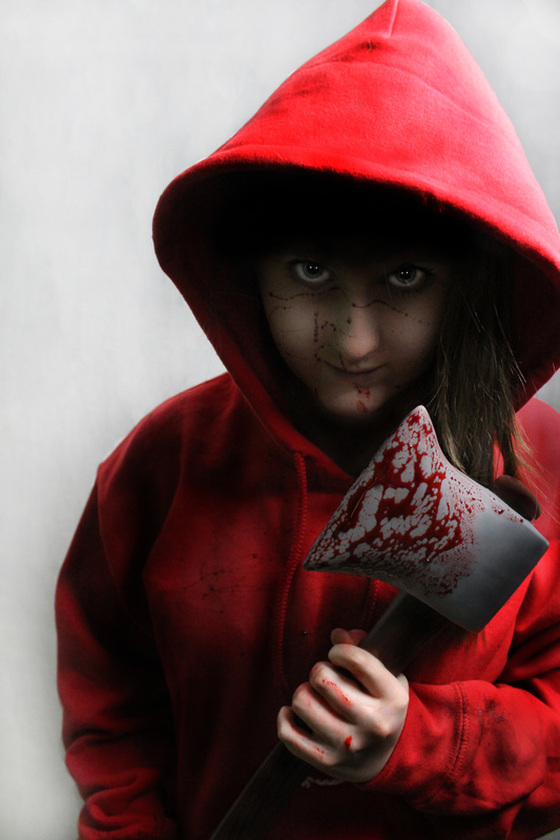
'Red Riding Hood'
This photo-shoot was my first attempt at creating a modern-day representation of Red Riding Hood, or Red Riding 'Hoodie'. I chose to use a white backdrop to create an eerie, cold feel to the image as well as to contrast against the bright red of the jumper; thus making it stand out more. Additionally, the red hoodie needed to be one of the main aspects as it is the most iconic features of the story and therefore needed to be the most recognizable, to make it seem slightly more aggressive and 'dirty' I damaged it and made it seem more grubby and worn by rubbing it against brick walls and fraying the material. For the axe, I used a plastic prop axe which I would later edit in Photoshop to make it seem more realistic as wood/metal. This, too is an iconic feature from the Red Riding Hood story, initially used to save her, however I wanted to subvert it and cause it to become a weapon rather than a method of defense.
Another prop which I used was fake blood, I flicked this onto the model's face and hoodie to make it seem as though she had killed something and the blood had sprayed onto her face. Additionally, I covered the blade of the axe in this blood to make it apparent that she was now the attacker rather than the attacked.
I wanted the lighting to obscure a portion of the face, mimicking the typical 'hoodie' images, perhaps the eyes and some of the nose- giving off the impression of being anonymous and hiding one's identity. To do this, I used a single large soft light above the head, angled down so that the shadow from the hood fell over the model's eyes.
Editing/ Adding the Axe.
In many of the images, the model, lighting and composition was successul, however because of the angle of the image, the axe wasn't visible. As this is one of the main features of the photoshoot and is one of the most iconic probs from the story of Red Riding hood, I used Photoshop to make the axe visible.
To do this, I selected one of the more successful images where the axe was not visible or was obscured by the model. I then selected another image in which the axe was visible.
I used the 'Quick Selection' tool to choose the are which I wanted to transfer to the primary image. I then erased the model's hood after positioning the axe in place, giving the impression that the axe head belongs to this image. I also used the 'Burn' tool to add appropriate shadows where necessary to make it more believable.
Before.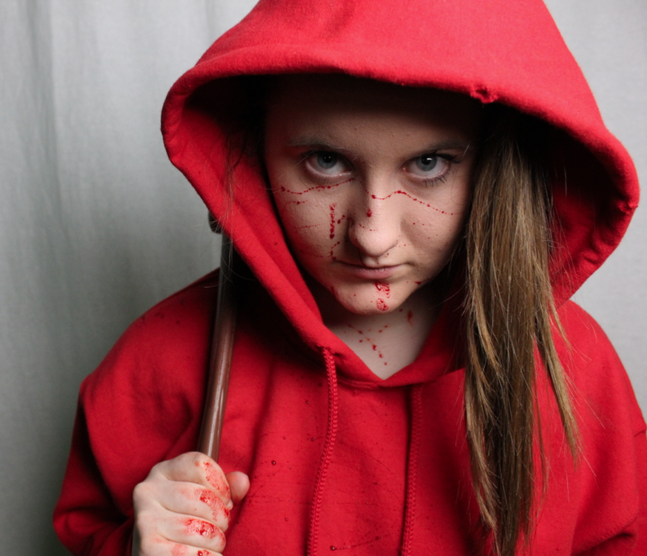
|
After.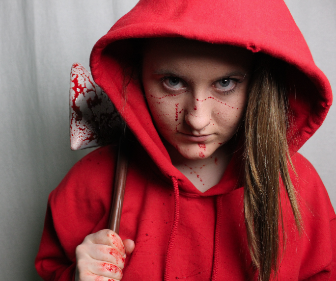
|
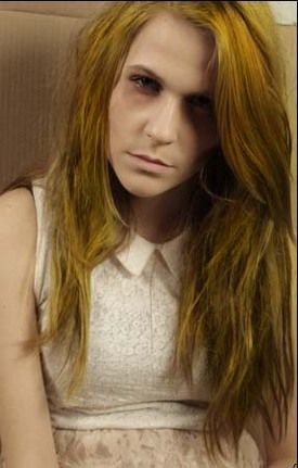
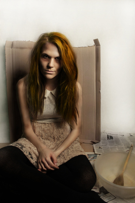
'Goldilocks'
As an adaptation of the story 'Goldilocks and the Three Bears' I chose to recreate the protagonist Goldilocks, however I wanted to show her in a different, more sinister way. By exaggerating the story, I decided to portray her as a homeless beggar, or squatter; due to the fact that she breaks into the bears' house and eats their food/ sleeps in their beds etc.
To do this, I used costume, hair and makeup to show the idea that she was homeless and unclean; the costume, while still reflecting that from the book (girlie skirts and blouses in pastel colours) has been changed by adding features such as ripped tights and creases in the clothes to make her seem uncared for. Additionally, I used a combination of 'Talc' and hairspray to make the hair seem matted and dirty as well as using pale foundation and dark eyeshadow around the eyes and cheekbones to make the model appear thin and malnourished.
I created the setting with iconic features and props which are associated with homeless people; newspapers, bin liners and cardboard. The props are also used to reflect the storyline but subvert it; the porridge is eaten in the text, however, I used the theme of a bowl and spoon but to show them empty as she has no food, and on a large scale- a mixing bowl and wooden spoon as larger props may make her appear smaller and therefore less powerful than she is in the book.
I wanted to use the lighting to reflect the sinister aspect of the image as well as carrying the style from the rest of the photo-shoots- I began by using split lighting with a single soft light, creating shadows across the model's face. I then went on to use a single hard light, this created harsher shadows on the model's face and therefore allows the images to seem more eerie and sinister, rather than the original happy story.
Enhancing the hair.
Photoshop steps.
To enhance the hair of the model and make it more yellow/ golden, I started by adjusting the Brightness and Contrast settings to make the initial colour of the hair slightly lighter and therefore easier to manipulate. I then selected the area which I wanted to change to yellow, creating a new layer and increasing the hue/saturation until I achieved the desired colour of the hair. To remove the excess yellow tint from the area around the hair, I used a soft-edged brush to remove this tint, revealing the original image underneath. To further emphasize the yellow hair, I used the 'sponge' tool to remove some of the colour from the rest of the skin, costume and cardboard.
Before.
|
After.
|
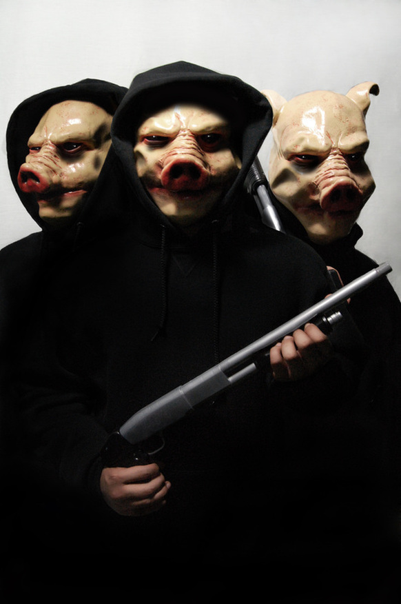
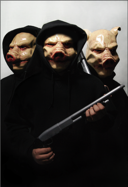
'Three Little Pigs'
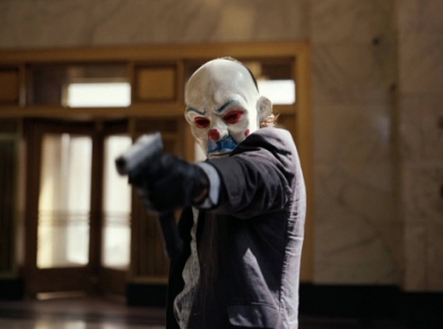
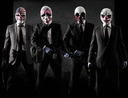
The Dark Knight: Bank Robbery Masks.
|
|
When I first thought of the idea of using masked robbers/ burglars to represents the Three Little Pigs, I initially thought of the scene from The Dark Knight where men are robbing a bank disguised as clowns. The idea of using masks is both sinister and connotes themes of wanting to hide identity; just as most criminals do (and modern representations of young people). Furthermore, the use of props such as weapons and guns makes these images both more realistic as criminals and yet more sinister when combined with eerily smiling masks.
Planning/Sketches.
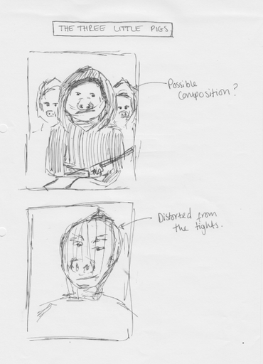
These were two of my initial planning ideas, in terms of costume and composition. I decided that I would either use the entire pig mask with a hood up, or use a pig nose on the model's face using the typical idea of pulling tights over the face in order to distort the features. This is something which is typically seen when robbers wish to hide their identity, and would also add an element of eeriness and surrealism- an aspect which I would like to portray in all of my images.
Pig Nose/ Tights.
This was my first idea put into practice for the 'Three Little Pigs'. As I decided to use the idea of bank robbers, I used the stereotypical idea of having tights pulled over the model's face to distort the features. I combined this with a plastic pig nose; to make it clear what story I was portraying in these images. However, I don't think this photoshoot was a success; the tights meant that the lighting was not creating the desired shadows accross the face as it dispursed the light more evenly than I had hoped- therefore eliminating shadows which create the eerie effect. Additionally, the tights didn't distort the face as much as I would have hoped and the strings from the nose were visible.
Final Photoshoot- Full Mask.
This was my second photoshoot for the idea of the Three Little Pigs. I used a full mask to cover the face; one which had plenty of texture and creases which would therefore create the shadows I desired for the image to look eerie. Furthermore, I added the use of props and costume more effectively- using a prop shot gun and a black hoodie and gloves gives the image a more realistic feel. I used a single hard light above the model's head which created both a shadow under the top of the hood and other shadows across the face.
In terms of the composition of these images, I intended to edit them on photoshop so that there are two 'pigs' in the background and one 'leader' in the foreground; this is why I have captured many of the images from different angles other than simply head-on. I wanted to make the images seem as menacing as possible, therefore I had some where the model was looking away ad some where he is facing the camera.
In terms of the composition of these images, I intended to edit them on photoshop so that there are two 'pigs' in the background and one 'leader' in the foreground; this is why I have captured many of the images from different angles other than simply head-on. I wanted to make the images seem as menacing as possible, therefore I had some where the model was looking away ad some where he is facing the camera.
Combining the images on photoshop.
Before I can begin to properly edit these images, they need to be combined to form one image containing three models; thus representing the three little pigs. I did this by selecting the images which I wanted to use and layering them on top of one another. I then used the eraser tool with a soft edge to erase the upper layers, revealing the models behind. This made it seem as though there was one image containing three models. I then used the 'burn' tool to create shadows which made the images seem more believable and as though they were in front of eachother
Before.
|
After.
|
Final Outcome.
Red Riding Hood.
Robin Hood and His Merry Men.
Goldilocks.
The Three Little Pigs.